MARKET RESEARSH
AI Functionalities
Text Analytics
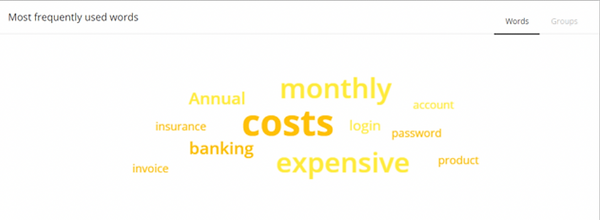
o Word Clustering – Gathers and analyses all open comments received from feedback forms on your website or mobile app. With this data, the software can distinguish sentiment, highlight frequently used words (with positive and negative sentiment) as well as look at the correlation of certain words (referred to as word clustering).
o Frequency of Word Counts – Topics are counted and brought to the topic based on frequency mentioned.
o Word Grouping – Grouping unrelated words through association.
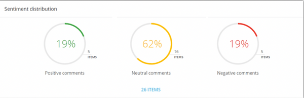
o Sentiment Analysis – Automatically gauges severity of feedback by sorting words into Positive, Neutral, and Negative categories by their definition and presenting a high level view of the general sentiment
o Automatic Categorization – Completed based on predefined tags and parameters. Errors can be manually fixed.
Issues with Data Analytics
Big Data Analytics
o User Experience – Hard for users to navigate the system and grasp information from its reports.
o Messy Data Visualization – Complexity of the report requires long processing times to find the necessary information.
o Overengineering – System provides an overwhelming number of features that makes it hard to use.
o Long System Response Times – System takes too long to analyze and interpret the data for timely solutions to be created.
o Inefficient Data Organization – Large amounts of data can be overwhelming if it is not properly visualized.
Issues with Data Visualization
Big Data Visualization
o Oversimplification of Data – One of the biggest draws of visualization is its ability to take big swaths of data and simplify them to more basic, understandable terms; trying to take millions of data points and confine their conclusions to a handful of pictoral representations could lead to unfounded conclusions, or completely neglect certain significant modifiers.
o Human Bias – Algorithms used to translate data into visuals are based on human inputs, which can be subjective; the “most important” piece of information can be subjectively interpreted. The aesthetics of the designer may also skew the interpretation when certain scale values are omitted or manipulated.
o Information Overload – When visualizations include too much data, information overwhelms, and data melts into a graphic soup that most viewers can’t stomach.
o Overreliance on Visuals – Using visuals to interpret data, which can be done quickly, can undermine the information presented. These conclusions can be misinterpreted as the complete truth if the user does not delve into the actual data set.
-
Misleading Color Contrast – Creates false value disparities that may seem to be higher than they actually are
-
Improper Use of 3D Graphics – Creates false hierarchies
CONCLUSION
The overarching problem that we, as UX Designers, face here, is Data Analytics. The Dashboard is simply a solution that is intended to solve this issue by presenting Big Data in a method that is easy to understand. Data Visualization is the solution to the Data Analytics that Dashboards intend to solve. As the Nielsen Norman Group writes: “Data dashboards are intended to quickly communicate important information without requiring large amounts of time or cognitive resources to interpret.” Users experience the most issues in Data Visualization because of the Color, Shape, and Groupings in which the data is presented; the NN Group’s in-depth studies into the usability and readability of data visualization methods find that Circular and Area-Based Graphs are difficult to interpret quickly. “As a result, encoding the most important information in linear charts and graphs enables users to perceive the critical relationships between data before they even fully pay attention to the visualization.” They recommend the use of Linear Charts and Graphs to visualize data, colors that meet the accessibility standard, and 2D graphics.
SOURCES
Alton, Larry. “4 Potential Problems with Data Visualization.” May 08, 2016. https://www.datasciencecentral.com/profiles/blogs/4-potential-problems-with-datavisualization Bowers, Micah. “Numbers Shouldn’t
Lie – An Overview of Common Data Visualization Mistakes.” https://www.toptal.com/designers/ux/data-visualizationmistakes
McKinsey & Company. “Making Data Analytics Work: Three Key Challenges.” March 2013. https://www.mckinsey.com/~/media/McKinsey/Business%20Functions/McKinsey%20
Digital/Our%20Insights/Making%20data%20analytics%20work/Advanced%20analytic s%20transcripts_final_NEW.pdf Nielsen
Norman Group. “Dashboards: Making Charts and Graphs Easier to Understand.” June 18, 2017. https://www.nngroup.com/articles/dashboardspreattentive/ Trofimov, Boris. “5 Challenges of Big Data in 2021.” February 15, 2021. https://www.rtinsights.com/5-challenges-of-big-data-analytics-in-2021/